
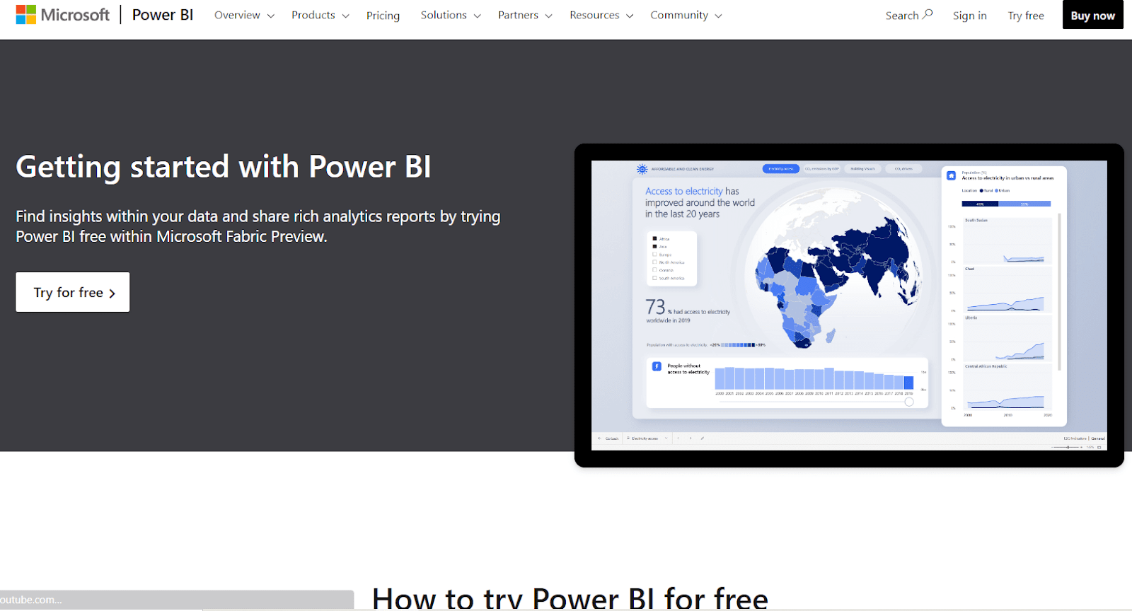
Power BI
Updated on Feb. 26. As a business intelligence tool, this dynamic software is getting popular now. Power BI is a great option for any rapidly functioning business, just like a control panel. It acts as a super organizer. Shall we look in?
So, don’t forget to read until the end.
What purpose does a Power BI serve?
There are several important reasons why an entrepreneur must utilize.
Please remember we put the dashboard option at the 8th point, not because of less important. The dashboard is vital. The matter is we have further insights next to.
Got it?
1.0 Data Analysis
With the use of measurements, DAX formulae, cutting and dicing, filtering, as well as additional tools, Power BI’s built-in analytical and calculating capabilities enable users to learn new things about their data.
2.0 Data Visualization
Users using Power BI may quickly and simply view data using interactive charts, graphs, tables, maps, and dashboards. This improves the comprehension and use of complicated data.
3.0 Distribution
Insights may be shared with a large audience by publishing Power BI reports online and embedding them into portals, websites, and applications.
3.0 Cloud-Based
Data is safely saved in the cloud and is accessible from anywhere thanks to Power BI’s cloud-based architecture.
4.0 Reporting
The report builder in Power BI makes it simple to create stunning, interactive reports.
plus it features dynamic visuals that are capable of being exported into PDF or PowerPoint.
Data Integration Power BI can link to many different data sources, including;
- SQL Server, Excel,
- cloud services, and
- web data, to draw in data.
It serves as a hub for data.
5.0 Data modeling
To convert unstructured data into a schema. It is suitable for analysis and visualization.
Power BI offers guided and sophisticated data modeling tools.
6.0 Collaboration
Coworkers may exchange data and results using Power BI tools. and several users can work together on identical data models and reports.
7.0 Automation
The AI and machine learning capabilities of Power BI automate some processes.
such as;
- finding patterns in data,
- predicting future values,
8.0 Dashboarding
Yes, finally, we came to an important task.
With the help of Power BI’s dashboarding features, users can design fully customizable panels. and packed with visualizations to provide them with a high-level perspective of important data and KPIs.
Stakeholders can access dashboards.
In Power BI, what is a dashboard?
Key metrics, trends, and conclusions are gathered in Power BI dashboards, which are engaging visual representations of data. With the help of Microsoft’s Power BI, users can;
- connect to a variety of data sources,
- convert and model the data, and
- produce interactive visualizations & reports.
Power BI dashboards are powerful. It presents pertinent data in a way that is both aesthetically pleasing and simple to comprehend.
They provide for data-driven decision-making by enabling users to track and evaluate data from many sources in real time.
Here are the Power BI dashboard’s essential elements and functionalities…
01 Visualizations
Dashboards are there to use several visual components that display data visually, including charts, graphs, tables, & maps.
Key measurements and trends are visible now. quickly and easily. By viewing these representations.
Users have a large selection of pre-built visualizations to pick from, or they may design their own visualizations depending on the unique data and analytic requirements.
02. Tiles
Individual tiles that each represent a different visualization or data piece make up dashboards.
On the dashboard canvas, these tiles may be scaled and placed to provide a unique arrangement.
So, Users may delve further into individual data points or further study the intricacies of a report or dataset by linking each tile to it.
03. Interactivity
Here, Users of Power BI dashboards may interact with the visuals to learn more by doing so.
Users may interact with the graphic components to filter, slice, and dig down into the data.
Through this interaction, users may examine various aspects of the data, get answers to certain queries, and look for trends.
04. Live Data Updating
Live data sources may be integrated into Power BI dashboards to provide planned or real-time data updates. This guarantees that the dashboards constantly show current data and reflect the most recent changes in the information that underlies its sources.
To keep the data up to date, clients can set up automated refresh schedules.
05. Sharing and collaboration
Sharing Power BI dashboards allows for simple collaboration and distribution of information within teams or organizations.
Users may regulate access rights, share dashboards with certain people or groups, and work together in real-time on the same dashboard.
This encourages a culture of data sharing & transparency and supports data-driven decision-making.
Users using Power BI dashboards are given the ability to track important metrics, spot trends, and gain an understanding of their information in a visually appealing way.
They offer a consolidated and configurable view of the data, allowing users to make wise decisions and effectively communicate their findings.
Power BI dashboards are an effective tool for data visualization & investigation, whether they serve for individual analysis or team analysis.
Of course, these are the technical points.
But can we suggest how to get started, nevertheless?
Yes, really.
Look closely for these guidelines. It will definitely help with the journey.
As you know, technology will not fulfill the particular essentials completely. But why not you can fill the gap between technology and the business objective?
Which techniques for creating Power BI dashboards work the best?
These recommended practices may be used while building a dashboard with Power BI:
Step 1: Plan your objectives.
Start by outlining your dashboard’s goals and purpose in detail.
Choose the most important data and insights to share with your audience.
You may create a dashboard that is efficient and targeted by having a clear understanding of your objectives.
Step 2: Create a data model.
Consider the connections you must make to the data sources and the links between the tables as you decide which to connect to. When necessary, alter and clean up your data using Power Query.
Make an efficient data model that includes the supporting calculations and visuals you want to display.
Step 3: Select pertinent visuals
Choose the best visuals to show off your data. There are many other visual options available in Power BI, including;
- maps,
- tables,
- bar charts,
- line charts, & more.
When selecting the images, take into account the type of data you have & what insights you are trying to convey.
For ideas and inspiration, consult the Microsoft Power BI visualization collection.
Step 4: Create a simple, logical arrangement.
Put your images in a logical, intuitive order. Make sure the arrangement is aesthetically pleasing, simple to comprehend, and draws the attention of the reader to the most crucial insights.
Create a coherent information flow by grouping relevant graphics using grids, containers, and sections.
Step 5: Use filters and slicers
To provide interactivity and give users the option to slice and dice the data depending on several dimensions, incorporate slicers and filters. This makes it possible to explore and analyze the dashboard dynamically.
Step 6: Format your documents consistently and efficiently.
To keep a uniform appearance, make sure that your visuals all use the same colors, fonts, and styles. To improve readability, use formatting and font sizes that are suitable. Use visual formatting tools like data bars and conditional formatting to draw attention to key data elements.
Step 7: Include pertinent background information and justifications
To give context & explanations for the visuals, add text boxes, titles, and captions.
- Assist users in comprehending the information presented.
- the conclusions drawn from it and
- whatever steps they should take in light of the information.
Step 8: Iterate and test
Test your dashboard frequently to make sure the data, features, and performance are accurate. To pinpoint areas that need improvement, ask users and stakeholders for their opinions. Adapt and improve your dashboard depending on changing company demands and user wants.
Step 9: Publish and share
To share your finished dashboard with your target audience, publish it via the Power BI service.
To manage access and engage with others, think about utilizing workspace collaboration & sharing capabilities.
Step 10: Keep monitoring
Keep an eye on the effectiveness and utility of your dashboard at all times. To keep the data current, update the sources of information as necessary. and refresh schedules as well. Utilize user input and evolving business requirements to continuously examine and improve your dashboard.
You can build a robust and successful dashboard using Power BI that successfully conveys insights and facilitates data-driven decision-making by adhering to these best practices.
Why do we suggest Power BI as a dynamic solution?
Just see how useful Power BI is
The following list of crucial factors will help you decide whether to use Power BI and one factor that may influence your decision:
1. Instant starting
With a simple setup, no formal training needed, and built-in dashboards for services like,
- Microsoft Dynamics,
- Salesforce, and
- Google Analytics,
you can gain insights immediately.
simplifying the process of publishing and sharing
Analysts submit visualizations and reports to the Power BI platform. rather than sending big files through email or storing them on a shared disk.
and their data is automatically refreshed anytime the source dataset is changed.
2. Current information
As data is sent or streamed in, dashboards change in real-time, allowing users to instantly address issues and spot possibilities. Real-time data and graphics may be shown and updated in any report or dashboard.
Sensors in factories, social media, or any other location where time-sensitive data may be gathered or communicated can be sources of streaming data.
3. Adaptability of security features
RLS- Row-Level Security, accessible filters, which could be configured with report creators, can reduce the possibility of unauthorized users viewing data by ensuring that viewers only see information that is pertinent to them.
4. Integrating Cortana
Cortana, Microsoft’s virtual assistant, is compatible with Power BI.
Users may obtain charts and graphs by speaking inquiries in natural language. Those who utilize mobile devices may find this to be of particular benefit.
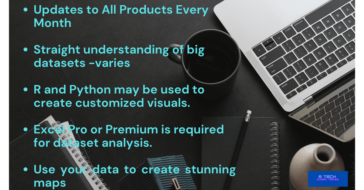
5. Artificial intelligence
Users of Power BI have access to text analytics and picture recognition, can build machine learning models, & can interface using Azure Machine Learning.
5. Ability to alter the navigation of the Power BI App
Report makers now have the ability to adjust navigation to make it easier for users to access material quickly and comprehend the connections between various reports and dashboards.
thanks to an “App navigation experiences” feature.
What Power BI capability can provide a thorough study of the data distribution?
The Histogram chart is a dynamic tool that may provide an extensive study of the data distribution. An illustration of the pattern of data is called a histogram.
So, the number of points of data that fit into each bin is displayed along with the data’s grouping into bins. Each bin’s height indicates how frequently or how many times a certain number of data points fall inside the bin’s range of values.
When using Power BI, you can build a histogram chart by choosing the Histogram chart style within the Visualizations column and then choosing the data columns you wish to use.
To acquire a more detailed understanding of the data distribution, you may also change the number of bins and the size of the bins.
When using Power BI, the histogram graphic helps examine the data distribution’s shape, spotting outliers, and comprehending the data’s range and variability.
Additionally, you may be able to spot patterns or trends throughout your data that are not immediately obvious from a straightforward tabular view.
Trends of BI
Analyzing raw data to identify trends, obtain an understanding, and improve decision-making is known as data analytics. It analyzes and visualizes data for companies and organizations using tools including Excel, SQL, Python, & Power BI.
Data science uses a variety of tools. A tool stack is used in data science. The most widely used tool for data cleansing, analysis, machine learning, and automation is Python.
Analytical tools that are trending…
The Next R is then utilized in academics, research, and statistical analysis.
Data visualization and business intelligence technologies such as Tableau, Power BI, Looker, Excel dashboards, and Python plots follow.
Hive, Kafka, Hadoop, and other big data and machine learning tools.
Summary
Power BI is a…
- Set of software services,
- applications, and
- connections
Why? They are there to combine and transform your disparate data sources into…
- coherent,
- engaging visuals, and
- interactive insights.
Data storing takes place in a hybrid data warehouse.
that is both cloud-based and on-premises, or it may be an Excel spreadsheet.
Hope the content helps the business.
Cheers!
Read more on related topics here. Business management software, business intelligence software,