21 Web Design Mistakes to Avoid in 2024
Is your website’s design successful? Are you sure? The sad truth is there are several mistakes still exist. Do you wanna recognize and resolve them? If yes, this will be the article “21 Web Design Mistakes to Avoid in 2024”, that you are searching for.
Firstly, the question is why it isn’t unaware, such a bad misdisign?
- The website owner doesn’t know them.
- Sometimes, even though know, but don’t take any action.
- Not taking a review from a professional.
- Not knowing the impact of each mistake in figures.
Of course, this is the worst mistake the majority of websites make.
So, get ready to dive in.
You may be a blogger or e-commerce store owner. even if it might be a small business or a medium-sized business.or large scale. It doesn’t matter these points are relevant to them all.
The website is an online presence of the business. Without your notice, there might be some common and specific mistakes, that you have to clear out.
Why do website mistakes have to be recognized soon?
Before a major or significant failure, it has to be caught. The worst case is sometimes those mistakes might not cause any direct damage, it might make negative results sooner or later. so, let’s get started “21 Web Design Mistakes to Avoid in 2024”
21 best Tips to identify web design mistakes
Certainly, we‘ll state some significant issues. Wait a bit! Did you ever have a proper goal for website design? This is the palace where the cancer starts to spread. Look at your goal again!
It’s no matter how long it takes. Make it clear.
Number 01: Unresponsive web design.
Luckily this has a low possibility to happen. Because many page builder tools in the market are using options to create responsive designs for
- Desktop interface
- Tablet interface,
- mobile UI option.
if you are not neglected. So, use it properly. Check for all pages that what is the Outlook page. Can edit it many times if you are not happy with it.
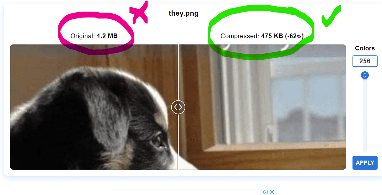
Number 02: Adds visual noise
What does it mean? The term “adds visual noise” describes components that take away from the coherence or clarity of an image, design, or visual composition. Visual noise is anything that impedes viewers’ ability to concentrate on the main topic or message, such as extraneous details, clutter, or distractions. Several things, including cluttered backdrops, contradictory colors, superfluous patterns, and unnecessary writing, might contribute to it.
Visual noise is essentially anything that throws off the visual balance or message of a picture.
Look at this example.

Finally, they corrected the issue later. see the green box in 2nd part of the image. like this check your website’s texts that make visual noise and replace them with nice titles.
Number 03: Law quality design.
Even without the main issues, there might be a poor design. this indicates a lack of experience. avoid them immediately. This is sometimes a lack of concern. If you are running an online business, identify and take immediate action.
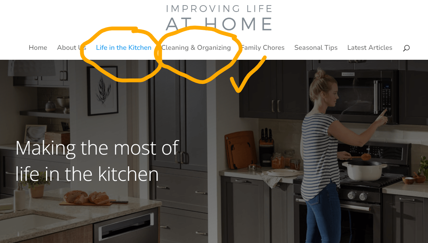
Number 04: Poorly Configured Navigation Layout
Navigation labels are common to most websites. But it’s not true. Why? It doesn’t make any value with SEO. Why don’t you make them;
- Specific,
- helpful, and
- keyword-focused.
Look at this site. Done well.

Of course, you can rewrite them as descriptive, indicating the relevance for the search engines.
Look at this site too; it’s a good example.
If you use G4 analytics, check the “path explorations” option. You can point out how many visitors clicked over the menu and sub-menus.
Number 05: Disregarding the Website Security-First approach.
The security of your page viewers matters. It’s vital. Lack of web security for visitors will have serious consequences. Even Google is also might be penalized. So, concern on, over design features.
Keep the website core files updated, use the latest php version.
Number 06: Non-optimized images
All image has to be optimized. If you use a carousel, heavy images significantly reduce the page loading speed. This causes your website visitors to leave off page. This means the bounce-back score will rise.
Ok, let’s jump on the next enthusiastic one!
Number 07: The low-quality and vague home page headlines
This is sometimes the most important. Why does a visitor come to your page? He has a specific intention and searching for an answer which may be the solution of his own. Then what can happen now?
Look at this page. ( we do not expose the site, because it’s a live site so, our concept still appears there.)
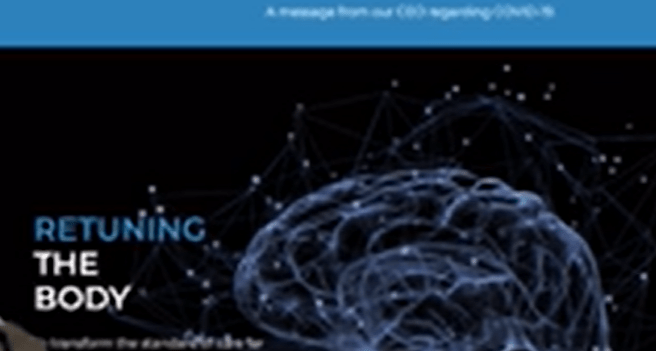
The visitor is getting confused about what you are going to say at the first impression.
“Returning the body”? What does it mean?
Of course, there might be descriptive by your side. Remember this is not enough. get in to always visitor’s shoes. Understood?
This is not the way. You are missing out. Tell visitors, directly and specific terms in simple understandable words.
Is this possible? Why not? Recorrect and test it honestly. That’s it.
Next one…
Number 08: most common universal navigation labels
This is the same type of mistake, that millions of website designers make. Of course, these navigation labels are common for many websites. But, mistaken. It’s not the way. It doesn’t indicate any relevance to website readers or to search engines.
Examples of common useless navigation labels are…
Blog, product, learn, company, support, contact us, etc.
Edit them strategically.
Number 09: Low Web page loading speed
This is crucial, even Google’s major ranking factor. If there is no quick load, again you will lose many page visitors, definitely. because there are tons of similar options on the internet. They will try them out quickly Abandoning “the effort to see your unseen site” within no time. Absolutely this might take a second.
You have to do everything possible when designing. Furthermore, even though the internet is a highly engaging place. Don’t make it a boring intention to the visitor. In business-wise, there will be a financial loss even.
Number 10: Lack of clear CTA’s
This is the next Stupidity. Why are you designing a website? Have enough money? Make your viewers into customers. Let them purchase your goods or services. Create a clear attractive, eye-catching button and the background. CTA buttons are more delightful and should be strategic. So, place them in the right spot.
Number 11: Stock Images of common people.
Are there stock photos of people? This is also useless. It looks like keep your visitors away from your website. Take your way. So, be smart. Put a quality picture/s of the team or family. if possible put your pic.

Means a real person. People will love it. And it makes authenticity. It shows the confidence of the site owner. Don’t you like that?
Example: “Sandra’s yoga tips”
If you like not to show the face, then put on a nice yoga posture.
Or a pic of the “team of yoga”
Like that. It will make your site more unique. Replace with nice group images with convey a strong message.
Number 12: Social media icons on headers
What for??? It doesn’t make any value for the visitors.
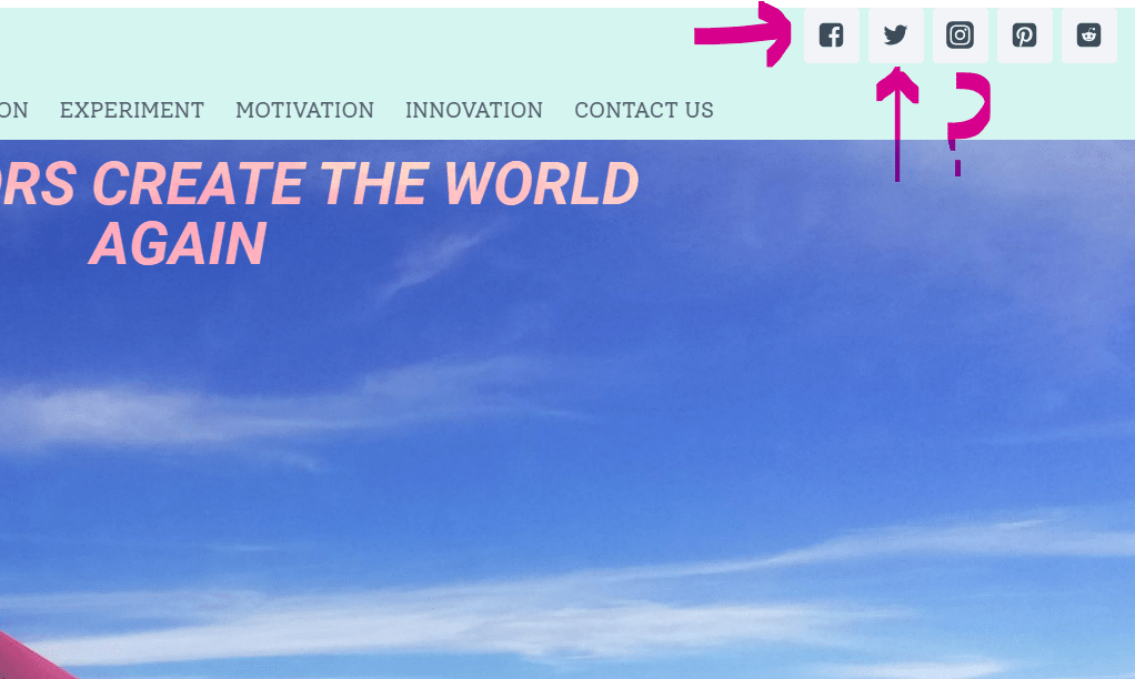
Don’t do that. Don’t waste your traffic, while it’s difficult to make & easy to lose.
If you want to do this, use footers not on the heading.if you know your viewers are going there usually. It’s better to make them big and colorful social media icons. Got it?
Let’s go to the next one
Number 13: remove the dates of your blog posts.
Why? It’s not needed and will make a negative impact. The value of great content will not fade by dates. It will carry important support for the users still. Then the first impression if a visitor sees the date! They might bounce back. “Oh, a bit old article” People will tend to read the latest posts. If there is a 2-year-old post. but, still carries a trending topic!
In my experience, there are plenty of “old” articles still make “a significant value”.
As an example, how to set up Cloudflare cdn? Even after 5 years, the main process is still the same. Only just a few steps have been added. Actually, the process has not changed. Added stuff is for user-friendliness.
So, try to remove the dates of blog posts.
Number 14: Using non-relevant color schemes.
This is a bit advanced technique. Carefully select a color pattern that fits well on the business. Or if you have a color scheme strategy. Use it. Viewing a website is a game of psychology. And it represents your identity. Your brand’s identity. Don’t lose the attention of viewers. Google reports say 90% of web pages have no good traffic. Don’t get listed there.
Number 15:Content- Overloaded Webpage.
A webpage with too much content can be troublesome. that because of the type of business. There is no theory “large pages make more traffic or conversion”. Contents should be “purpose enough”
Overwhelming visitors
That can happen when excessive text, photos, videos, and pop-ups might result in information overload. They may not be aware of the most crucial pieces of information or where to look.
It’s just like, throwing stuff on the face of the visitor, when “they” are searching for a specific thing. understood?
Clarity problems
Users may have trouble finding what they’re seeking or understanding the page’s main message when there is so much stuff vying for their attention.
Navigation issues:
Users may find it challenging to locate menus, buttons, or similar navigational components if the webpage layout is busy.
A webpage with an excessive amount of content might increase the likelihood that users will make mistakes, such as selecting the incorrect button or overlooking important details.
Number 16: Not prioritizing Grid and Columns.
How does this happen? No one can do it perfectly. But, make sure to eliminate some issues regarding this category. if you check back, can recognize it.
Structure and Organization
The content of your website can be firmly arranged using grids and columns. They establish hierarchy and order, which facilitates users’ ability to scan and locate the information they require.
Visual Harmony
This is true. Don’t make a mess at first sight of the webpage. Grids support the development of visual harmony and coherence across your website. They keep things from looking jumbled or disorganized.
Efficiency
We do not advise not to use grids. But create wisely. The process of designing is made easier by grids. You may efficiently arrange pieces and guarantee uniform spacing by using a baseline structure.
Number 17: Not Ensuring Cross-Browser Compatibility.
“Not Ensuring Cross-Browser Compatibility” in web design describes a website that doesn’t work or looks good in all web browsers.
Consider that even though your website looks fantastic in Google Chrome. but, it appears jumbled and has broken pictures, and non-functional buttons when viewed in Firefox. That webpage doesn’t work well across browsers.
Number 18: Using long paragraphs
This will lose the comfort of readability. Don’t try to make your visitors bully. Screen reading is not as comfortable as a book or a magazine. So, feel free to prepare the right comfort reading place stuff.
Use short paragraphs as much as possible. If there is a must to do so, break the paragraphs into smart parts like bullet lists/ numbered lists. Use some relevant and easy-to-read colors. add some images. And mix them wisely. This will attract visitors to your information strategically.
Number 19: Unreadable PR Release.
What is this? PR release/ press release or news release articles. it is a written statement sent to the media by a firm or organization to convey some vital public information. To make current affairs or other significant information public, press releases are utilized. Announcing new goods, financial results, mergers, or other significant information can be done with them. Companies may form partnerships with media sources, increase brand exposure, and save advertising costs by utilizing press releases.
If they need to be there, please avoid placing a rough paragraph format. Make it user-friendly. Or use the Storytelling method.
Number 20:Ignoring Custom 404 Pages.
404- “ page not found” is a common error that can occur frequently, or for some specific reasons. Neglected error pages can damage your website’s reputation and brand. It could imply a disregard for the user’s experience or for specifics.
Users who receive a generic error notice may become irate and uncertain about what to do next. This may cause them to completely give up on your website.
You’re losing out on possible conversions and more exploration if you don’t provide users with helpful advice or keep them on your site.
Use a site scan tool like Ahrefs. It will help you to recognize them and take the necessary action to remove them immediately.
Number 21: Empty Thank you pages.
This is also the next missed opportunity. Some websites with highly engaging and super fast-moving categories like an airline’s website. They have a Thankyou page with only fewer triggering words. Like just,
- “Thank you”: { don’t come again}
- “Goodbye”: {get vanish and find another better one}
What? Is that what you say? Never ever do so, add a returning technique like CTA. or at least ask visitors to subscribe to a newsletter.
Which is more critical while building a business website?
Within the discussion of “21 Web Design Mistakes to Avoid in 2024” ” Are the majority of websites business websites? Yes, mostly. Web designers occasionally make mistakes while developing company websites, which can have a detrimental influence on the usability and efficacy of the site.
Look at the typical errors made by web designers.
This section is related to the above topic: 21 Web Design Mistakes to Avoid in 2024. But there is a difference.
1. Inconsistent and confusing navigation:
Inconsistent navigation can irritate users and make it challenging for them to locate the information they want. It is the responsibility of web designers to make sure that the site’s navigation is clear, uniform, and easily visible on all pages.
2. Slow website loading times:
People want websites to load quickly, and they could quit if a site takes too long. For quick loading times, web designers should reduce the amount of code, optimize pictures, and use caching strategies.
3. Inconsistent branding:
The colors, typeface, and logo positioning on a company website should all be consistent with the brand’s identity. The brand’s image might be weakened and visitors may become confused by inconsistent design features.
4. Inadequate responsiveness to mobile devices.
We discussed this in the list. But, to specify it for business websites critically.
Websites must be responsive to mobile devices given the rise in their use. The responsiveness and proper presentation of a website across a range of screen sizes & devices is the responsibility of web designers.
5. Overwhelming or crowded design:
Visitors may find it difficult to concentrate on the main content of a website if it is overly busy with too many components, too much text, or invasive advertisements. The goal of web design should be to create a simple, orderly layout that highlights the most crucial content.
based on the objectives and particular circumstances of the company website. Understanding the intended user base, putting usability first, and continuously testing and improving the website for peak performance are all components of good web design.
Summary:21 Web Design Mistakes to Avoid in 2024
This is a vast subject. You may study further on this matter. There may be some other web design mistakes, that might affect your online business. An individual expert will show some of them. So, feel free to have a full site check.
Hope this content helps.
Cheers!
Read more on related topics here. create a business website for free, what is CDN?